/Institutions/Help/json/catalogs.json
05929EFD-84E2-4189-91E5-408BBE245DAB
Field Types
This page describes the different field types that are can be implemented with Syllabus Management.
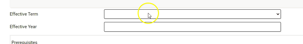
Drop-down
Drop-downs show a list of options where only one value may be selected. Any options for the field must be provided in the "Options" column of the form template (Example: Fall, Spring, Summer, etc.).
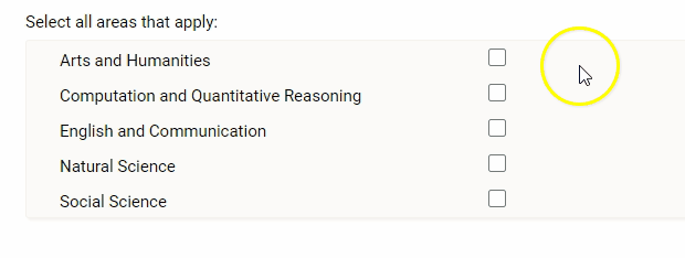
Check-boxes
Checkboxes are a list of options where more than one value may be selected. Any options for the field must be provided in the "Options" column of the form template.
Radio buttons
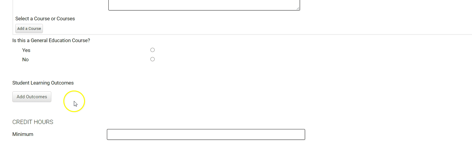
Radio buttons show a list of options where only one value may be selected. This field functions similarly to the drop-down field, but displays all of the options on the form. The most common use of this field type is for "Yes/No" questions.
Note: If there are a lot options available to select from, we recommend using the drop-down field to reduce the amount of space used on the form.

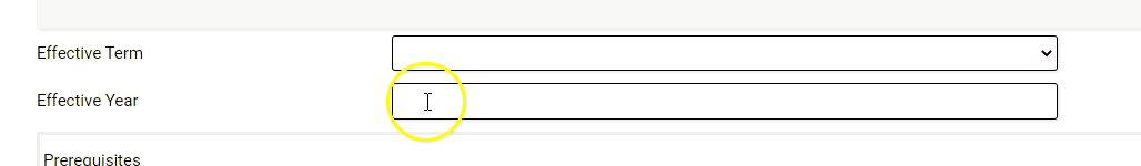
Text box
A Text box field provides a small 'box' to enter a single line of text.
Note: If more than a line or simple answer is needed, consider using a "Rich text" field.
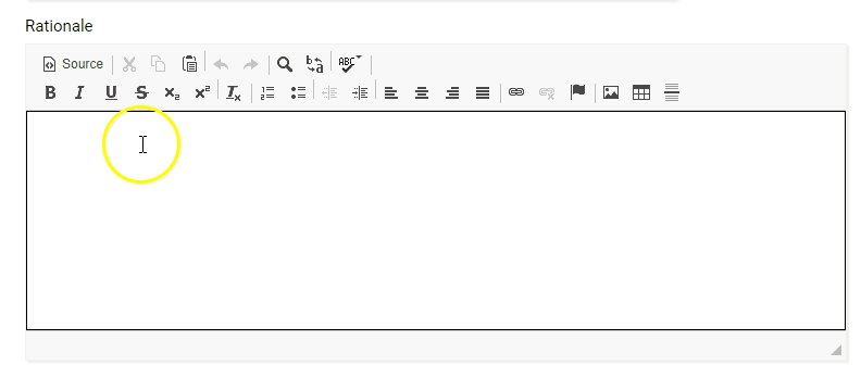
Rich text
The Rich text field is a large text area that supports additional text formatting.
Outcome
The outcome field allows for multiple individual outcomes to be added to the syllabus. These can be imported into the system using a CSV file. Please refer to the Course Learning Outcomes Import Guide for more information.
Note: If you are utilizing the Curriculum Management System to manage outcomes, please add "Outcomes" to the "Existing Course Data" tab in the form template.
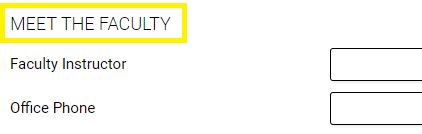
General Header
A General Header is used to create sections by displaying as a large section header on the form. Text will display in all caps and is used to group fields on the form.
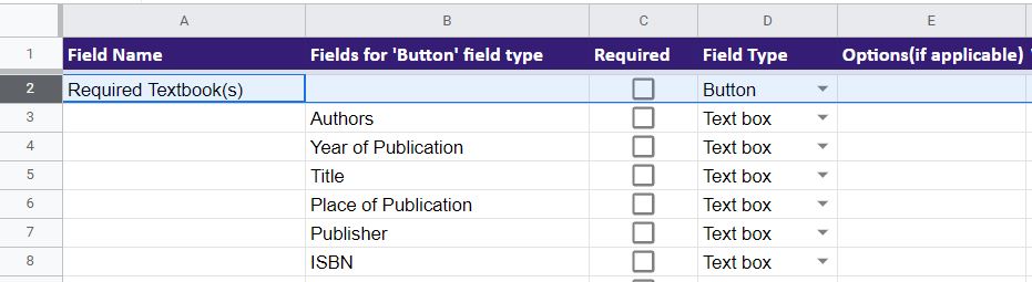
Button
"Buttons" are a unique feature that allows you to utilize a group of fields to represent an item that can be added multiple times. When adding more than on instance of the item, they can be reordered or deleted.
Field Name: This column is used to collect the label or name of the overall field/button.
Fields for 'Button' field type: This column is used to represent all field(s) associated with the field name/button. These fields will be grouped together to create an "item" on the form that can be added multiple times.
Example from the form template:
Example on the web form:
